
This Project of Special Merit, which ended in 2023, was focused on providing data, tools, and training to coastal communities in Wisconsin. The project’s main focus was the Lake Superior region and one of the key issues impacting communities in that region: culverts.
As rain events become more frequent and intense, so does the damage to culverts. Through inventory and mapping, at-risk culverts can be identified and upgraded replacements can be justified. This project aimed to provide the resources needed for coastal and culvert managers to quickly and appropriately respond to damages or identify vulnerable culverts before catastrophe.
Archived Blog Postings from WICDI.org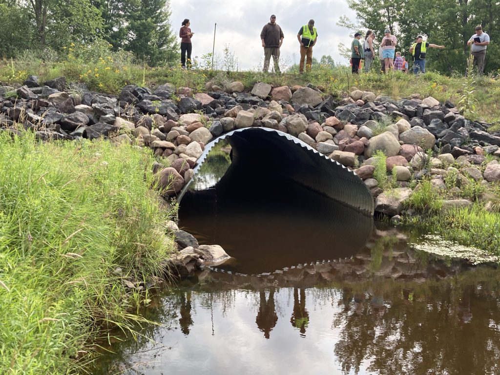
Oct 21, 2019 — WICDI Fall Workshop Recap
Jan 29, 2020 — Data Submissions!
Feb 19, 2020 — WICDI Winter Workshop Recap
March 18, 2020 — WICDI & the Coronavirus: What You Need to Know
Sept 28, 2020 — Fall Workshop Coming Up on 10/6!
Nov 18, 2020 — Getting to Know GLSCI
Jan 18, 2021 — Winter Workshop Coming Up on 1/21!
Sept 13, 2021 — Double Feature: WICDI’s Summer In-Person and Virtual Workshops, Part 1
Sept 17, 2021 — Photo Callery: Culvert Workshop, Lincoln Township – July 29th, 2021
Nov 24, 2021 — Double Feature: WICDI’s Summer In-Person and Virtual Workshops, Part 2
WICDI Community of Practice Map
Funded by the Wisconsin Coastal Management Program and the National Oceanic and Atmospheric Administration, Office for Coastal Management under the Coastal Zone Management Act, Grant # NA18NOS4190087 and Grant # NA20NOS4190105.